
 Andy Mansfield is the art director at Lonely Planet Kids and has played a vital role in shaping the kids' list over the last few years. Before joining Lonely Planet, he worked for many years as a designer and paper engineer at Templar Publishing, a well-respected publisher of innovative children's books in London.
What is your mission for Lonely Planet Kids?
We want to show kids the wonders the world has to offer in the most accessible and exciting way possible. By doing this, we can gain a reputation for high quality, innovative books that inspire and educate, but most of all entertain and delight.
How did you go about creating the standard design for the brand?
I was tasked with making our book covers visually consistent and more recognizable. There are many tricks of the trade to achieve a "look" across a publishing list, from using a restricted font set, sticking to a standardized art style, using very strict colorways, a combination of all of these and more. I felt we had to be careful not to go down a route that would overly limit how creative we could be with our covers in the future because, with such a wide range of possible future titles, we needed to build in some flexibility.
We also looked at the branding of our instantly recognizable travel guides to see if there was anything there we could adapt to bring a flavor of the parent brand to our kids' books. It's from here that we developed the idea of the blue spine--a device used on the core travel guides--and the blue banner across the front. The addition of the light blue cap above the logo means that we now have a recognizable spine no matter what the width.
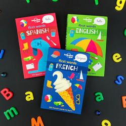 Beyond designing for the brand as a whole, are you personally illustrating some of the books? Do you have a hand in cultivating talent for new books?
I’ve been lucky enough to have illustrated a few of our recent titles. First words--our new language series for young readers (March 2017)--most recently. I also illustrated the first titles in our family activity range and worked on the paper engineering and illustration for our little pop-up cities books.
Having worked in the industry for quite a few years, you tend to have favored illustrators, but you're also always on the lookout for new talent. For our upcoming Incredible Cabinet of Wonders title, I wanted to use a different artist for each of the beautifully illustrated cabinets that make up the book. It was tricky to find artists who were happy to illustrate just a single double-page spread rather than a whole book, but due to our good relationships with artists we've worked with before, we were able to get some of them to contribute to about half of the book. For the rest, we looked for some fresh faces. It worked well for both parties, as it meant we could get some exciting new artwork styles and they could try something a little different from their usual style that could then be used for their portfolio.
What are you most excited about in the future of Lonely Planet Kids?
We're growing our list year-on-year, so we have more titles than ever in the pipeline for 2018. I'm just making a start on a very exciting follow-up to How Cities Work with James Gulliver Hancock, and we have a book on ancient civilizations in development which is going to be amazing. I think I'm most excited to be working on a new big pop-up book. I'm eager to be able to get my teeth into some complex paper engineering again!