 In his first picture book, Paul Thurlby makes the most of palette, type and composition.
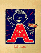
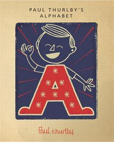
The British graphic designer builds his compositions on the capital letter that correlates to his subject on the right-hand page. Opposite, the left-hand page displays both the capital and lower-case letter against a bold, solid-colored backdrop--ideal for children just learning the alphabet. But those who have mastered their ABCs will most appreciate these witty illustrations. "Q for Quicksand," for instance, stars a red egg-shaped fellow with arms outstretched in fear, and one leg already submerged--for a perfect Q shape. "A for Awesome," which creates a portrait of the energetic boy on the book's cover, uses red, turquoise and navy on a sand-colored background. Two balls fill the centers of the capital "B" for "Bounce," in a composition of red, beige and navy with a slightly less green shade of light blue. Next, in front of a mesh net, only the goalie's arms form the "C" to "Catch" the soccer ball. Here, Thurlby incorporates the light blue that dominated the "B" spread, and introduces a gold background hue (for the left-hand page) that also colors the bone for the "D for Dog" spread. The artist carefully plans his palette to subtly carry his color scheme through the compositions, and precisely placed lines create a sense of movement.
Thurlby offers a variety of visual approaches. "G 4 Graffiti" breaks with the usual pattern ("4" in lieu of "for"), and the artist also leaves a message on the brick wall backdrop ("Paul woz ere"). He forms the type for "K is for Karate" (a boy's K-shaped karate stance) with the swish of a brushstroke that resembles Chinese calligraphy. At times, he plays with texture. The capital "I" itself forms an "Island," and crinkled paper suggests waves. Children may pick up this whimsical volume to learn their letters, but they'll also come away with a heightened aesthetic sense.--Jennifer M. Brown

