

|
|
| Cathy Goldsmith (photo: Mike Meskin) |
|
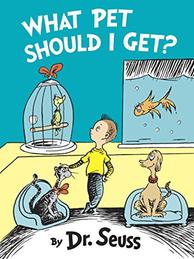
The first book that Theodor Geisel (aka Dr. Seuss) and art director Cathy Goldsmith, v-p and associate publishing director of Random House Books for Young Readers, worked on together was I Can Read with My Eyes Shut (published in 1978). Their last project together was Oh, the Places You'll Go! (1990). Just ahead of the publication of What Pet Should I Get? (to be released tomorrow), which stars the same brother-sister duo as One Fish, Two Fish, Red Fish, Blue Fish (1960), Goldsmith discusses what it was like to work with the legendary Dr. Seuss, and how this manuscript came to her more than a decade after his death.
How would you describe the dynamics of your working relationship? Did Mr. Geisel welcome input? Did he know what he wanted and stick to his vision?
I think whenever he submitted something, he thought it was finished--which is not to say that there wasn't some discussion and editing, all of it with his approval. When you suggested a change, he was willing to consider doing it, and sometimes he would not do it. There were other times when he would make changes.
Did his process change at all over the time that you collaborated?
He was pretty consistent.
 It was surprising to look back at One Fish, Two Fish, Red Fish, Blue Fish and see how all over the place it is. Perhaps only Dr. Seuss could pull that off. What Pet Should I Get? is much more narrative. It flows better, don't you think?
I think you're right. One Fish, Two Fish is all over the place. That's why I think What Pet Should I Get? actually came first. There's a place toward the end [of What Pet] where the boy goes through the fantasy animals. First he wrote about real-life pets in a truly narrative way, then he wrote a second book about these animals he made up. It's the other side of the story. I think you're also right that he's one of the few people who can do [what he did in One Fish, Two Fish]-- every spread has a different animal; then he pulls it all together at the end of the book.
Since you worked with Theodor Geisel for so long, you must have gone through the transition from pre-separated art on his early works to full-color art for his later books.
That was one of the discussions I had for myself when we went to choose colors for this book. The books up to this point had been done in two to three flat colors. There's a red ink, there's a blue ink and there's black ink in The Cat in the Hat; at no point do you mix them to get purple. You don't have any other colors in there. That's true in The Cat in the Hat Comes Back, too.
Ted used red, blue, yellow and black ink in One Fish, Two Fish. Shortly after that, in Hop on Pop, we have browns and purples and greens--everything that technology allowed us to do to mix the colors of the rainbow, if he wished to do so.
I wanted this one [What Pet Should I Get?] to be true to where it was historically, but I also felt that if he'd done this book, I don't think he would've wanted to do blue cats or dogs. These are real animals and they needed to be in realistic colors. Ted's father was the zookeeper in Springfield, Mass. So he came by his interest in animals in an honest way. I gave the kids some skin tone here, where we didn't in One Fish, Two Fish, so they'd hold their own next to the animals.
In this book, the backgrounds are flat--the walls, aquariums, the outside of buildings--but the animals have mixed colors, browns and grays. I think the background colors help make the artwork feel connected to his earlier works.
Did you have to fill in any gaps in the artwork, or was it essentially finished?
We drew no art for this book, with the exception of one or two lines, literally. At the very beginning there's a yellow box in the window of the store, we added the edge to the yellow box. Had he been alive to color it, he would have indicated the colors he wanted. He left us some rudimentary color notes. One page said yellow, and the pages with the store said red. I took that to mean the outside of the store should be red.
|
|
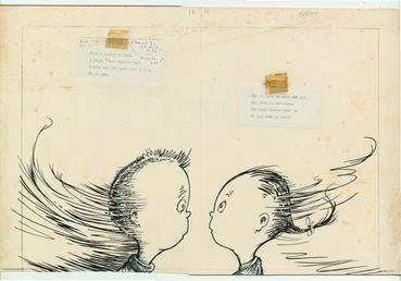
| from I Can Read with My Eyes Shut | |
When he turned in his work, he would take a Xerox to crayon on it, and show us the color he wanted. We had these color charts that he worked from, in his day, he'd have little blocks of color, a one-inch square, and each would have a code number: example 301, that would be 30% yellow, no magenta and 10% cyan. He'd be looking at a square of color, and say I want this shoe or this bird's plume to be this color.
Let's go back to your point about Geisel stopping work on this book, What Pet..., to begin One Fish, Two Fish. Can you say more about that?
I think he often worked on more than one thing at a time. He'd put something aside when something struck his fancy. Maybe he went back to it; sometimes he didn't. This book [What Pet...] comes from a very fertile time in his career. The idea that there was more than one thing going on seems perfectly possible to me.
I know that when I went out to the house to work with him on Oh, the Places You'll Go! he said to me that some of the images in the book had been in his head for years and he'd never found a way to use them before. When I came back to New York, I was describing his house to my father, who's an architect, and he said, "I think his house was in Architectural Digest at one time." There were pictures in the article of Ted's studio and two of the images of Oh, the Places You'll Go! were in this article, dated 15 years earlier. When he said the images had been around for years, he wasn't kidding.
The piece that you'll see is the piece that looks like hooks, on the way to "The Waiting Place." The other piece, that you don't see in the article, is the one with the billowing tents. [That image appears] the first time he writes in the book "Oh! The Places You'll Go!"
Tell us about the discovery of the manuscript for What Pet Should I Get?
In 2013, I got a call from Claudia Prescott, Ted's longtime secretary. They were cleaning out a closet and found a box that had some materials that she thought Random House might be interested in. When Ted was alive, he and [his wife] Audrey lived at the top of a mountain in La Jolla, and in the dining room on the table, everything from this box was laid out. That was the first time we had any idea of the manuscript; they didn't share that with us on the phone. About two years after Ted died, Audrey had decided to do some renovations on the house. She probably packed that in 1993, and for whatever reason, it didn't get moved with his other things, and nobody looked at it for 10 years.
 |
|
| The brother and sister stars of What Pet Should I Get? | |
There is such a consistency to the look of Geisel's books. How do you think he does that?
I think it has to do with the quality of his line work. At the time he started drawing, there were no computers or mechanical pens. [With mechanical pens,] no matter how much you lean on them, the thickness of the line doesn't change. Things today look much more even, much more "perfect." Ted drew with a Croquil pen, like a fountain pen, with a nib, so if you leaned on it, more ink came out. I personally love it. I think it gives his line a unique quality and an energy, I think it's one of the reasons you recognize his line. You feel the hand of a human being in his line work. --Jennifer M. Brown