
|
|
| Rilla Alexander | |
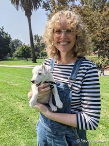
Rilla Alexander is an Australian-born, Los Angeles based designer, illustrator and picture book maker whose work has appeared on everything from toys and teacups to buses and buildings. Here Alexander discusses creating the Hippo Park logo and the Hippo Park Pals series.
Would you please tell our readers about the Hippo Park Pals books?
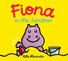
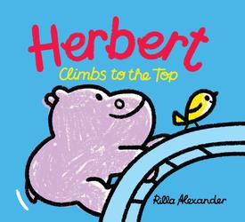
Hippo Park Pals are a series of tiny books for preschoolers. The first four books are set in a playground and are about what it feels like to summon the courage to go down the slide, or to choose a new shovel in the sandbox when someone takes the one you wanted. They're also about imagination--turning into a swooshing rainbow on the swing or transforming into an upside-down roller coaster on the climbing frame.
![]() You have a special relationship with Hippo Park: you are the creator of the Hippo Park Pals series as well as the person who designed the Hippo Park imprint logo. Which came first? The books or the logo?
You have a special relationship with Hippo Park: you are the creator of the Hippo Park Pals series as well as the person who designed the Hippo Park imprint logo. Which came first? The books or the logo?
The logo! I became friends with Hippo Park's art director Amelia Mack while she was at Chronicle Books. We worked together on the Touchwords series, Motor Mix books and Jane Yolen's A Bear Sat on My Porch Today. When she and Jill Davis were getting started with plans for Hippo Park, they asked me to have a think about the logo. They explained that Hippo Park was about play and a space to be creative, spontaneous and silly. They also shared stories and photographs of the real Hippo Park playground on the Upper West Side of Manhattan, which inspired the name--Jill raised her two boys nearby and often took them there.
Jill and Amelia were not convinced that the logo absolutely had to include a hippo, but amongst the sketches I did for them, there was a hippo who caught their attention. He had the right mix of personality and fun, was drawn loosely and simply in pencil and Jill immediately knew his name was Herbert.
 How did you go about making the logo into the Pals character?
While I finalized the logo and made sure it worked on such things as book spines and posters, we put our heads together to think more about who Herbert was. We decided that as a preschooler he would have been curious and imaginative and would have adventures in Hippo Park. That's when the idea for the books came about.
We named Herbert's sister Fiona after the baby hippo at Cincinnati Zoo. Coincidentally, I have a sister named Fiona. Herbert carries a teddy bear, who he sends down the slide first, because my other sister Emily told me that's what my nephew did when he was a preschooler.
Amelia suggested that rather than make board books we should make tiny full length picture books with dust jackets. Jill and I were very keen. I've got to say, everything from the logo to the books has been a true collaboration!
 You also created the branding style guide for the imprint. Is this something with which you have previous experience? How was it approaching your characters as marketing and publicity materials?
I spent much of my early career focusing on designing corporate identities for companies, big and small. No matter the company, I always found it impossible to design a logo and all the applications without also designing a character. It became something I was known for, and I have since designed characters that have been made into a mascot costume for an international airport, used on the signage and interiors of a kid's science laboratory and turned into toys and merchandise. I like seeing my characters come to life in all forms, but especially in stories. The best part, though, is seeing kids fall in love with them and drawing their own versions. I very much hope that happens with Herbert and Fiona.