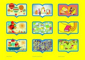
 Fast Company explored Mother New York's "electric" redesign for the 45-year-old Reading Is Fundamental children's literacy organization that "added some much-needed wattage to its staid and conventional branding.... More than a logo redesign, Mother created an entirely new visual language for RIF that is charged with color, art, and energy, an excellent companion to a brand that aims to spark ambition and a lifelong love of reading."
Krystle Loyland, Mother's head of new business, said, "Reading Is Fundamental is less about teaching kids how to read but fostering a love and hunger for reading. A love of reading can really spark ambition in a kid's life to help them continue to learn for a lifetime. So we determined that the target audience was really parents with young kids in the house, because whether you could afford books for your kids or not, you understand the power of reading and what it does."
Art director Christian Cervantes added that they "wanted this brand identity to capture that enthusiasm and optimism and power and love of reading. We wanted people to have an emotional connection to the brand, so in creating the identity we wanted it to appeal to their inner child. We wanted to develop a brand that people would be proud to wear or be a part of as opposed to feel obligated to give money too."
