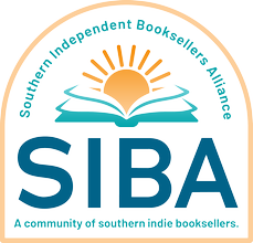
The Southern Independent Booksellers Alliance has unveiled a new logo for the organization, noting that the updated design--the first in 20 years--is the initial step in an extensive update and rebranding project announced earlier this summer as part of the organization's 50th anniversary campaign, "A Bright Future."
"The book industry has evolved and SIBA has evolved with it," said SIBA executive director Linda-Marie Barrett, "We want our new brand to reflect the forward-thinking and innovative nature of our diverse Southern bookselling community."
Since its establishment in 1975 (as the Southeast Booksellers Association), the organization has changed its brand only one other time, when in 2005 it changed its name to Southern Independent Booksellers Alliance and dropped the original rural-focused design for a more modern look.
Earlier this year, SIBA began working with Matchbook Marketing to create a new logo "that was brighter and more dynamic, better representing the organization and its membership as it exists today," the organization said. SIBA consulted with its membership and stakeholders during the six-month-long process, and they were instrumental in determining the final design: "Four colors instead of two, with the static book replaced by an open book and a rising sun, the new logo invites its booksellers into a community that excels in overcoming challenges."
The organization has begun updating the logo wherever it appears online. Booksellers attending SIBA's annual fall conference at New Voices New Rooms, beginning this Sunday, will have a chance to see the new logo "in the wild" on conference materials and signage, and be able to take home a celebratory 50th anniversary coffee mug.
"We are excited about the new look," Barrett added, "and we're looking forward to having our rebranding fully integrated by the end of the year."

