
|
|
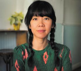
| Cátia Chien (photo: Michael Belcher) |
|
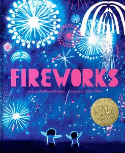
This week, Cátia Chien was named the 2026 Caldecott Medalist for her illustrations in the picture book Fireworks (Clarion Books) by Matthew Burgess. Chien is a Brazilian Taiwanese illustrator of celebrated picture books as well as the founder of A Thousand Worlds, a curated picture book directory celebrating BIPOC creators.
Congratulations! I imagine you're feeling lots of things right now. Would you name a few of those feelings for us?
Elated, grateful, proud, deep calm, shaky, purposeful and excited! Yes, lots of feelings!
Everyone always asks about how early the calls are, so... was it an entirely too early call?
I have heard about those early or very late calls! No, not at all too early. It was mid-day Sunday when I got the call. I was in the middle of walking through the parking lot of a bowling alley my eight-year-old son asked to go to. When the call was done, my husband cried (I was already crying) and my son said, "Mamai, I didn't know you were a famous artist. I thought you were only my good mamai." Then we stood there in the middle of the parking lot crying and hugging.
Was the entire committee on the line?
Jewel Davis, the chair of the Caldecott committee, called me on the phone and said "Hi Catia, I'm Jewel Davis the chair of the Caldecott committee and we are so happy to tell you that your book Fireworks won the Randolph Caldecott medal. You are on speaker phone with the rest of the committee. CONGRATULATIONS!!"
And everyone broke out into a cheer. Time freezes in moments like that. I think that's when I said, through tears, "Thank you, is this what I think it is?" And Jewel repeated it all over again.
Fireworks has already received numerous accolades for your illustrations. How does it feel to top those off with the Caldecott Medal?
It feels amazing and validating. Moments after the Caldecott call, Kate O'Sullivan, one of my editors for Fireworks, called me. After we were both done screaming in pure joy, she said to me, "This means that your book will be in print for a long long long time... forever." And that made me cry all over again. It really hit me at that moment that this book will have a wide reach and impact. I think that is what we all wish for with the picture books we create, that they will find their readers.
This isn't your first time illustrating for Matthew Burgess--you also illustrated The Bear and the Moon. How did you feel when reading the text for Fireworks for the first time?
I had an immediate emotional response when I read Matthew's text for Fireworks. Reading the text of Fireworks reminded me of myself as a kid: long summer days with my sister exploring our neighborhood and only coming home after dark to have dinner. Even outside of the pyrotechnics, I knew there was something in the poetry and the rhythm of the text that captured something magical about the life of a child. The unabashed exuberance and sense of being outside of time--the very outward expression of freedom within.
Did ideas immediately surface as you read the text?
Yes! Ideas typically come to me right away when I read manuscripts that really grab me. And Fireworks certainly grabbed me! But this doesn't mean I had it all figured out, far from it. I hold on to more questions than I answer in the beginning and maybe even toward the end of every book. And this keeps it interesting for me.
For example, some of the questions I sat with in Fireworks were: "What does sound look/feel like?" "What does heat look like?" "What is the movement of 'Whoop! Weee! Woohoo!' " "How does the first "POP" create a transition from before the POP?"
And at the same time, ideas also come from pushing against material constraints. So, taking a trip to the art store really helps. It is also so fun! I have too much art supplies at this point! Haha.
I (and so very many others) think one of the most staggering pieces of art is the massive "finale" spread. You use these fully saturated colors throughout the book and then the finale is entirely white and blue. Tell our readers about the decision to turn the fireworks into blazes of white light against a blue background.
Thank you! I created the cover first and the finale became an extension of the visual language I created for the cover. But they are two separate pieces. When I created the cover my thought process was that I wanted it to POP off the shelves so it could have an impact from a distance. I intentionally used high contrast--white against dark blue--to allow the shapes to read from far away and capture the feeling of pyrotechnics in fireworks.
Limiting the palette, I believe, also makes it more memorable and iconic. So that is why I kept it to two colors (white against dark blue) plus the accent color of Pantone fluorescent pink.
I think the spread of the two children absolutely going to town on giant slices of watermelon is wonderful. There is palpable joy in their messy faces and dripping hands. How did you create so much movement and emotion in that one still image?
I watched my son eat watermelon! It is a fully immersive experience the way kids eat watermelons. The face smeared with pieces of watermelon while the clothes are just napkins to catch all the juice. It is pure joy. I wanted to capture that. So, I took a lot of pictures of him eating watermelon and used that as reference. And then I made the watermelons just a bit bigger.
Is there anything else you'd like to say to the Shelf Awareness audience?
Independent booksellers and librarians create spaces where readers discover books they didn't know they needed, where conversations happen, and where communities gather around stories. As a kidlit creator, I'm SO grateful every time a bookseller connects my books with the right reader--that personal recommendation is irreplaceable. So, I want to say, "Thank you for the work you do every day to keep readers connected. I hope to visit as many of your stores as possible in the coming months!!" --Siân Gaetano, children's and YA editor, Shelf Awareness